
Redesign "PPGOS" app - a comprehensive UI/UX Case study
Overview :
About :
PPGOS stands for Parit Padang Global Online System. It is a B2B (business-to-business) e-commerce application developed by PT. Parit Padang Global (PPG), a subsidiary of SOHO Global Health in Indonesia.
Key Aspects of PPGOS :Purpose: It acts as a direct ordering application for customers, allowing them to purchase pharmaceutical products in a fast, transparent, and reliable manner.
Target Audience: It is designed for pharmacists, retail outlets, and partners to simplify the ordering process.
Features: The app includes real-time tracking, product promotions, reward points for purchases, and a "one-click" order functionality.
Why it need to be redesigned?To improve User Experience (UX)
To decrease confused that experienced by user while using the app
To improve speed and accuracy while purchasing the product
To give information for user about new promo, product information, etc.
Duration : 4 month
Task : research, design, testing
Team : Muhammad Habiburrohman
Role : ui/ux designer
Metode: Qualitative moderated usability testing - in depth interview
App version on android : PPGOS : 2.2.4
If you prefer explanation on video format, click this video below :
Stage 1 - Empathize
1) Observation :
I make observations by trying out the current app (PPGOS) and see where I feel constrained when interacting with them. After trying this apps, I noted a few points that could potentially to be improved.
2) Research plan :
Background :
Based on needs for pharmacist especially work on procurement and purchasing medicine and medical devices. They usually buy the stuff from pharmaceutical supplier and then use this product to hospital needs or sell it again to the patient. The pharmacist usually buy their needs by application that managed by the supplier.
Therefore, me as an UX designer want to redesign a user interface for the app, Make it easier for the user when they need purchase them.Objectives :
1) Find out how user search and buy a product
2) Find out how user check order or shipment status
3) Find out how user pay the due date invoice
4) Find out how user download the invoice (e-faktur)Method : Qualitative moderated usability testing- in depth interview
Parameter :
Success/ completion rate : It's often called the fundamental usability metric. completion rates are a simple measure of usability. If user succes on completing task, recorded as 1. If user can't, recorded as 0 (1=Task Success and 0= Task failure).
Time on task/ time completion : Time on task (TOT) tells you how long it takes a user to complete a task.
Sample specification :
Pharmacist work on medical product procurement
man/women
nationwide
Key information areas :
User flow and behavior on pharmacy product procurement
user profile
Timeline :
3) Discussion guide :
Introduction :
Hi, thank you so much for coming today! My name is Khabib, and I’ll be guiding you through this usability testing session. The session will take around 30 minutes, and we’ll go step-by-step through some simple tasks on two websites.Voluntary participation :
Before we start, please note that your participation today is completely voluntary. You can pause, take a break, or stop the session at any time if you feel uncomfortable. You can also ask questions at any point.Purpose :
The purpose of this session is to evaluate the design and usability of these app. We’re not testing you as a person, but we’re testing the design of the app. What we’re trying to learn is how real users like you — a pharmacists — actually experience the process of finding drug information online.Protocol :
During the session, I’d like you to say everything that’s on your mind while using the websites. There are no right or wrong answers here. For example, tell me what you’re looking for, what confuses you, or what you like or dislike, like the button, the icon, the color, etc. Just do it naturally at your normal pace, just like you would do in your daily work. Of course I'm gonna timering every task done, but it's just for the research not for competition.My role :
I’ll mostly stay quite and take notes while you’re completing the tasks. Sometimes, I might interrupt or ask follow-up questions,its' normal, it’s just part of the process. If you ever feel stuck, I might give a small hint, but I’ll try not to lead you too much.Recording consent :
On this his session, I will record the screen and your voice (mic) so we can review your interactions later. Is that okay with you?Warm-up Question :
Before we start the actual tasks, I’d like to ask a quick question:
Could you tell me a bit about what task you usually do in your work? Which apps do you use most often?During the task :
User flow and behavior :
- task 1 : please try to buy a product. You can stop until order done notification page
- task 2 : please try to check on your order or shipment status
- task 3 : please try to pay the due date invoice. You can stop until payment page appear
- task 4 : please try to download the invoice (e-faktur). You can stop until downloaded document notification appear
Good job!, So now we’ll move on to the tasks. Remember, just describe what you’re doing and what you’re looking for. Do it at normal pace. I’ll give you one task at a time.Closing :
Thank you again for your time and your insights. That’s all for today’s session. Do you have any last thoughts or comments before we wrap up?
4) Conduct research:
Usability testing of the current application is to find out how users interact with the application and to find out what pain points are felt by users. 5 users participated in this test. This test is moderated face-to-face. In this test, I have prepared 4 tasks for users. I record the screen so I can analyze how they interact with the app and can track important points when the user runs each task. Some of these tasks are :
User try to buy a product
User check order or shipment status
User try to pay the due date invoice
User try to download the invoice (e-faktur)
Testing result on current design
User | Task 1 | Task 2 | Task 3 | Task 4 |
|---|---|---|---|---|
User 1 | 55 s | 5 s | 40 s | 23 s |
User 2 | 80 s | 5 s | 15 s | failed |
User 3 | 70 s | 16 s | 19 s | failed |
User 4 | 60 s | 8 s | 18 s | 35 s |
User 5 | 60 s | 10 s | 38 s | 29 s |
What user say?
User has to click on detail product to add it on chart button
User has to click "plus" button to add 1 piece
Can't find the chart button.
the word "piutang" confusing me, it should changed to "hutang" or "pembayaran hutang", or "pembayaran tagihan"
To access due date invoice list, we have to click to click button on two different pages
The flow to access and download invoice (e-faktur) confusing me, there's should button placed on the home or on payment page.
Stage 2 -Define
1) user persona
Person 1
Name : Rizal Angga
Age : 37 yo
Profession : Pharmacist
Workplace : Pharmacy
Location : Blitar, east java
Status : marital, 2 child
Behavior & Habits :
Works closely with doctors and purchasing teams
Checks supplier stock every morning
Prefers using a phone at the office
Uses WhatsApp for supplier coordination
Values structured documentation.
Frustration :
Difficult to track order status when multiple suppliers are involved.
Invoice and e-faktur downloads often delayed
Manual reconciliation of purchase records takes too much time.
Feel overwhelmed by complicated user flow of procurement app
Goals & Needs:
Needs a reliable platform to manage bulk orders, monitor order status in real-time, and simplify payment & invoicing process.
Aims to reduce procurement errors and ensure medicine availability.
Person 2
Name : Rafi Pratama
Age : 28 yo
Profession : Pharmacist / Pharmacy Manager
Workplace : Pharmacy
Location : Blitar, east java
Status : Single
Behavior & Habits :
Often handles both patient service and purchasing
Makes small but frequent orders; prefers mobile apps for convenience; checks product availability during downtime
Manages supplier payments manually.
Frustration :
Hard to compare supplier prices quickly
Sometimes orders get delayed without notification
Payment reminders not well-integrated
Struggles to track due invoices.
Goals & Needs:
Wants a simple mobile-friendly ordering experience, transparent stock and pricing, easy access to e-faktur, and automatic payment reminders for due invoices.
2) User journey
Aspect | 1. Product Search & Selection | 2. Order Placement | 3. Order & Delivery Tracking | 4. Payment for Due Invoices | 5. Download E-Faktur / Invoice |
|---|---|---|---|---|---|
User Action | Opens app → searches for medicines → compares brands & prices → adds to cart | Reviews cart → selects payment terms → confirms address → places order | Opens “My Orders” menu → checks order progress → monitors delivery status | Opens “Billing” tab → reviews list of due invoices → makes payment | Opens order history → downloads invoice or e-faktur |
Touchpoints | Mobile app, search bar, product catalog | Shopping cart screen, checkout screen, payment screen, confirmation screen | Order tracking screen, push notifications. | Due date invoice list page ,Payment gateway, reminders | Order history page, invoice download button, file storage |
User Thoughts | “I hope the stock is available and price is competitive.” | “I need to double-check my order before paying.” | “I wonder if my order has been shipped yet.” | “Which invoices are due this week?” | “I need this invoice for reporting and tax.” |
Emotions | Curious → Focused | Careful → Slightly anxious | Impatient → Hopeful | Responsible → Stressed (if overdue) | Relieved → Neutral |
Pain Points | Limited filtering & product info; slow search results | Checkout lag; unclear confirmation message | Delayed updates; lack of shipment notifications | No automatic reminder; confusing payment history | Invoice often delayed or hidden |
Opportunities / Improvements | Add smart/AI search, live stock info, supplier rating | Improve confirmation page & add order summary | Enable real-time tracking & notification alerts | Add payment reminders & clearer billing dashboard | Auto-generate e-faktur instantly; allow bulk download |
3) User flow
User flow for task 1 :
User flow for task 2 :
User flow for task 3 :
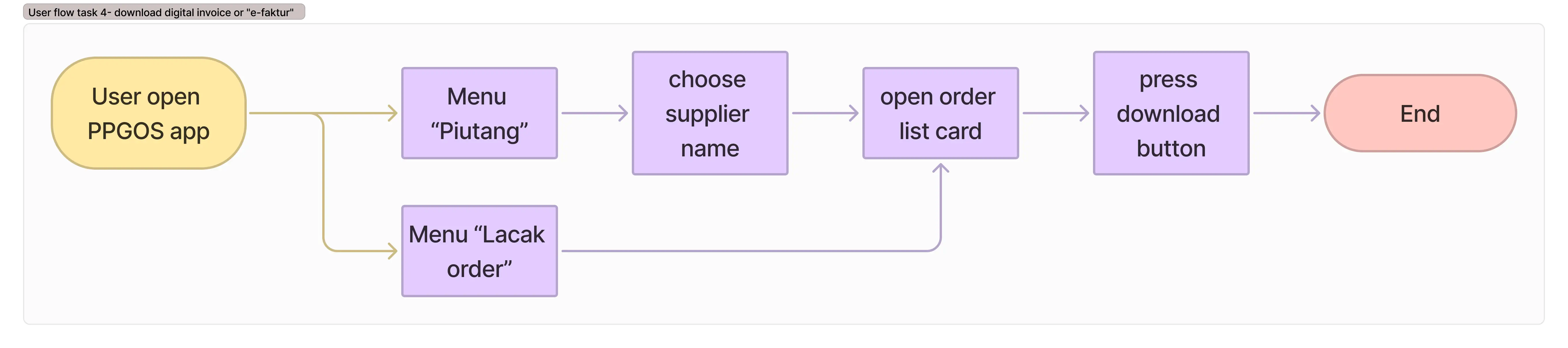
User flow for task 4 :
4) Identifying the Problem
Based on the results of the analysis on usability testing and the user journey map, there are 6 main problems faced by users.
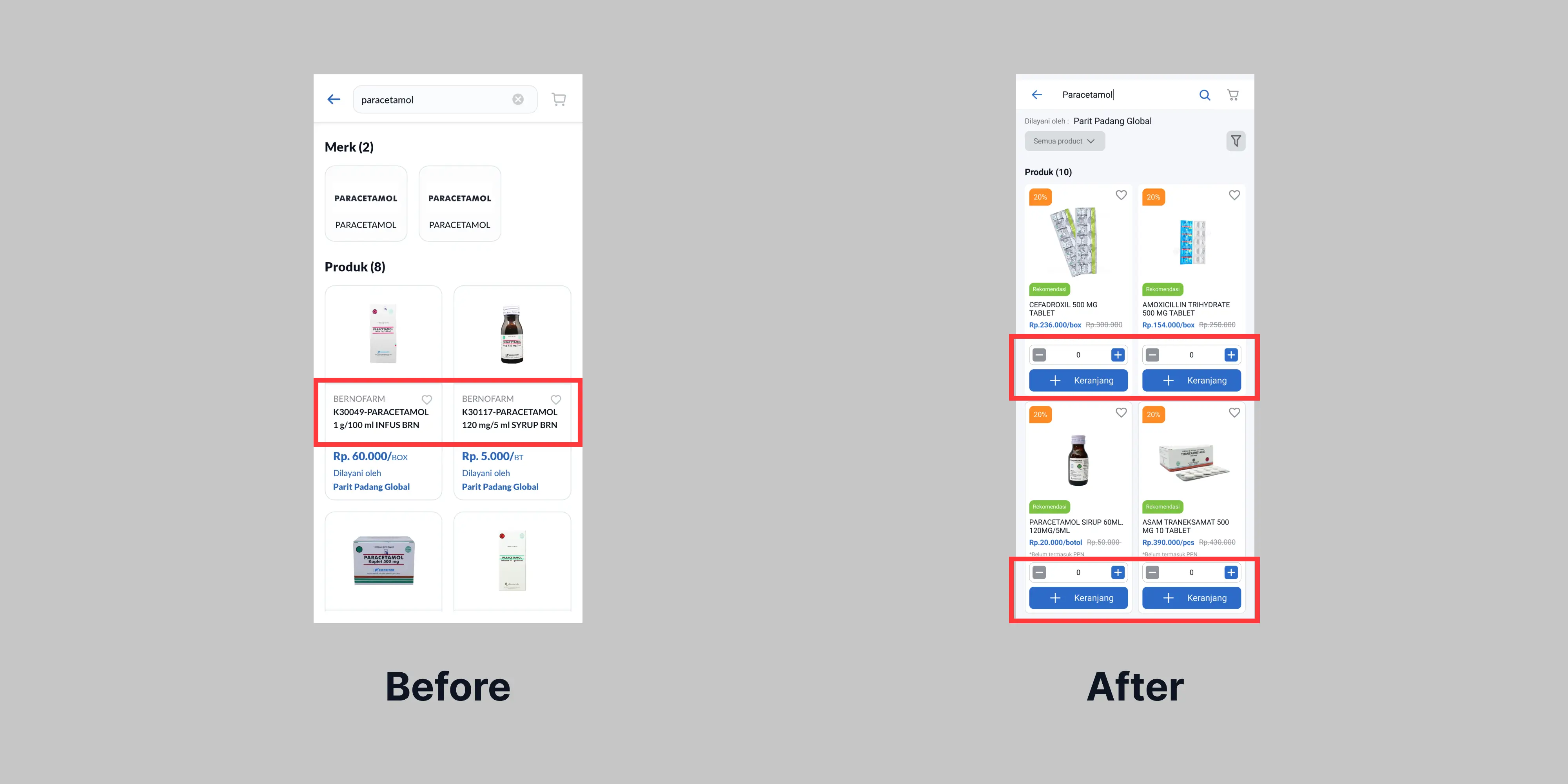
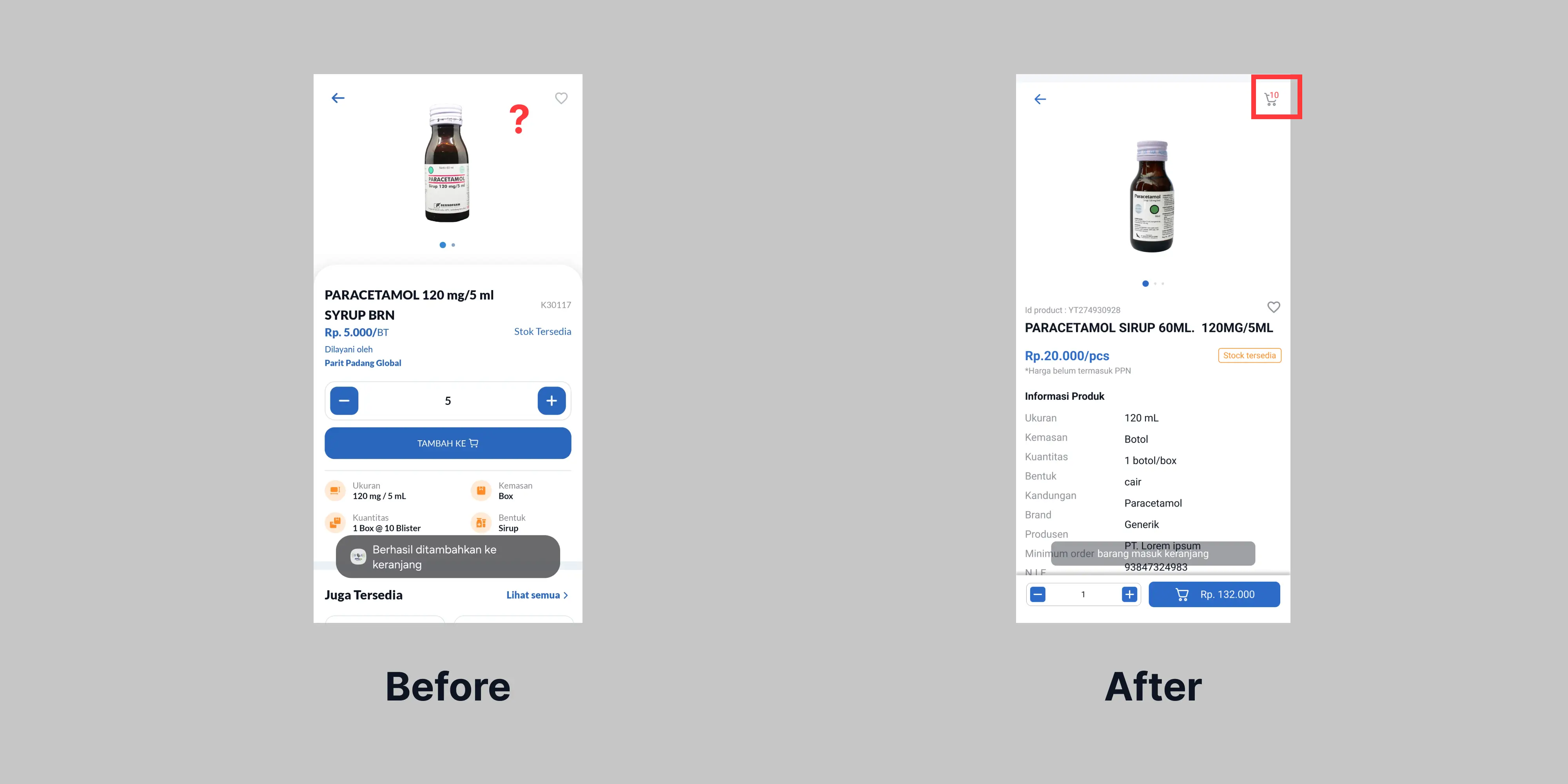
1. User has to click on detail product to add it on chart button
- Location : search page
- Problem detail : when users wanna add product to the chart, they have to click the product card. They can't add product automatically on search result page.
- solution : add counter and "add to chart" button in card product in search result page.
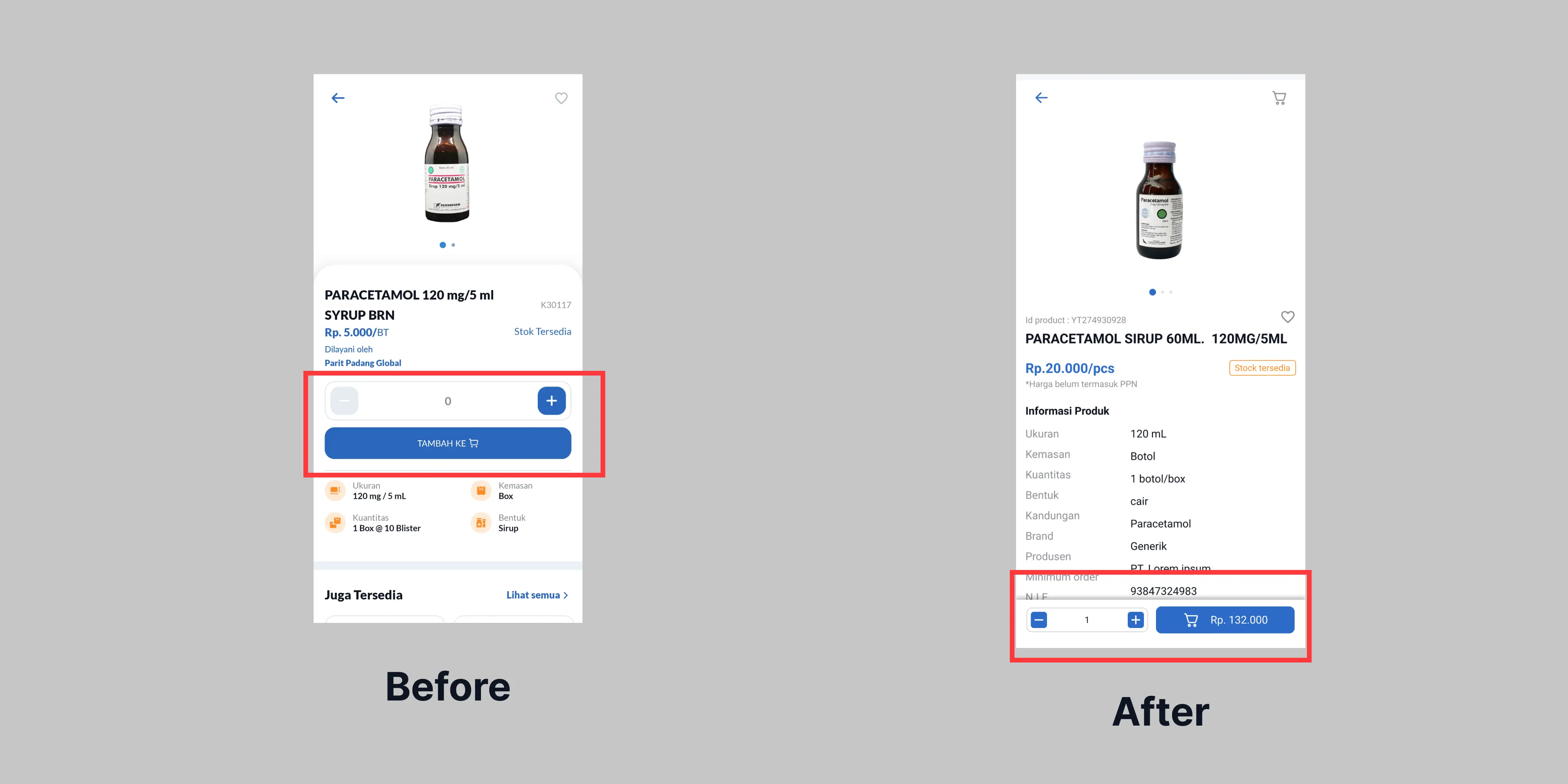
2. User has to click "plus" button to add one piece.
- Location : detail product page
- Problem detail : Usually when user check on detail product page, the number change to one. It can reduce step for user to order the product.
- solution : automatically set product view card quantity to one piece.
3. Can't find the chart button.
- Location : search result page
- Problem detail : when the user want to check out the product after add , they can't find the chart button. To access chart button, they have to click button back twice. The chart button will appear.
- solution : add chart button on search result page
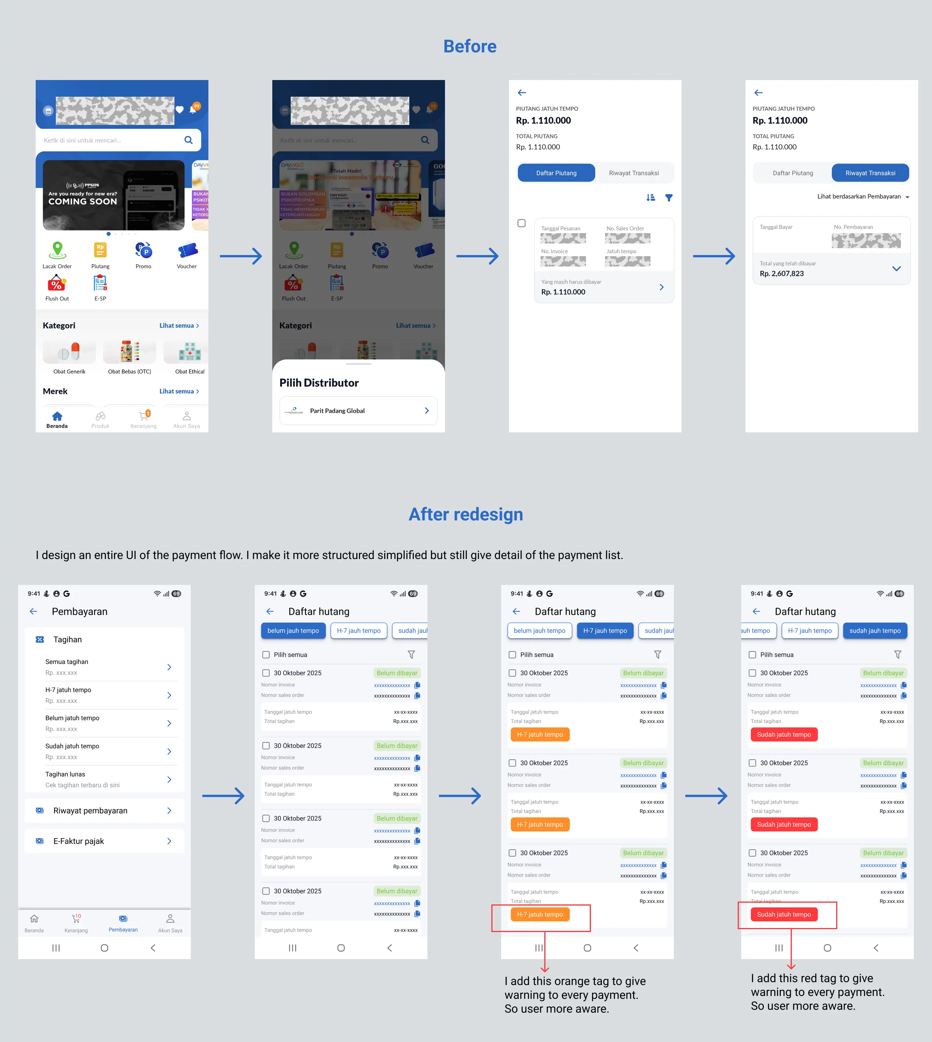
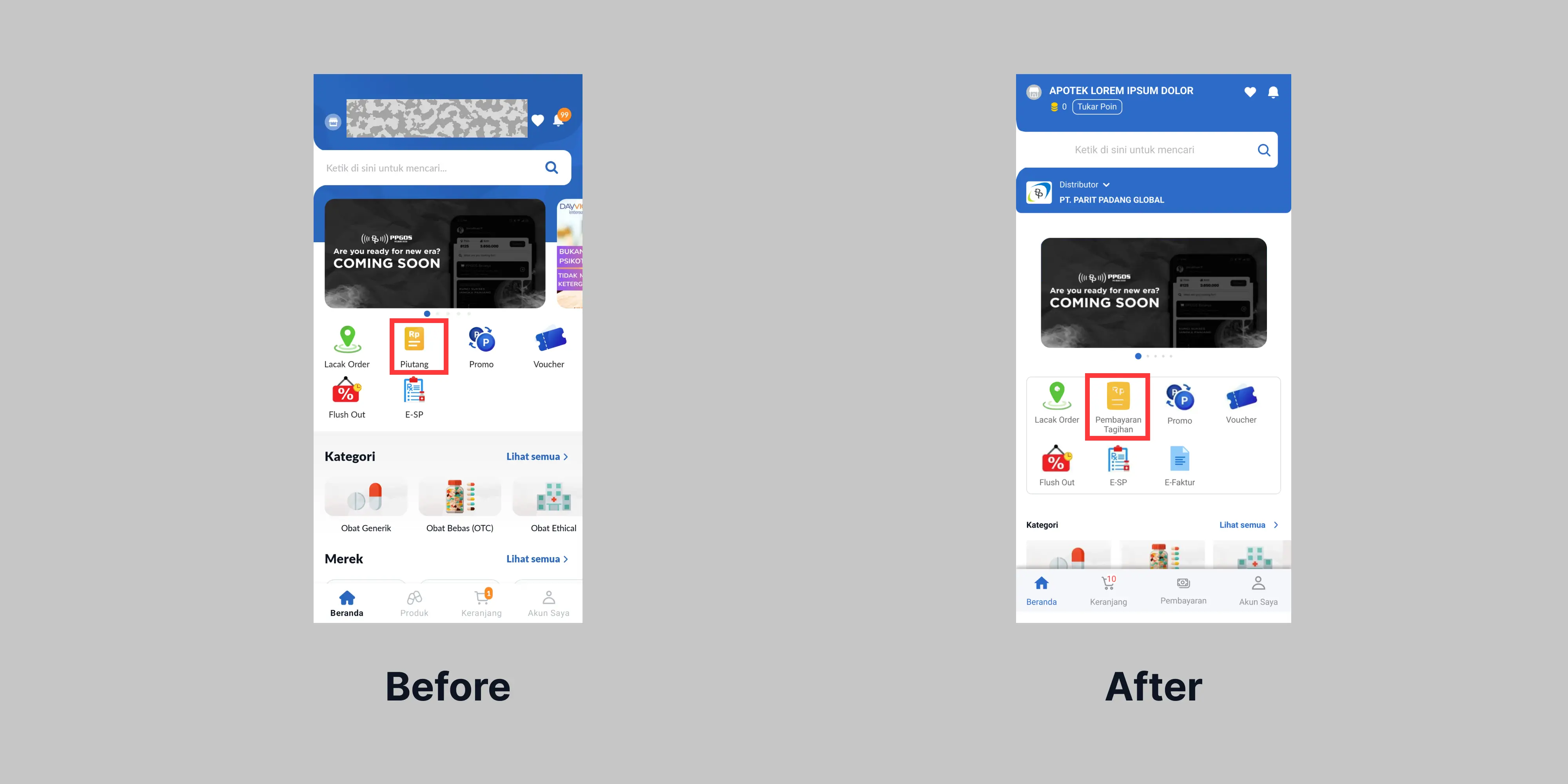
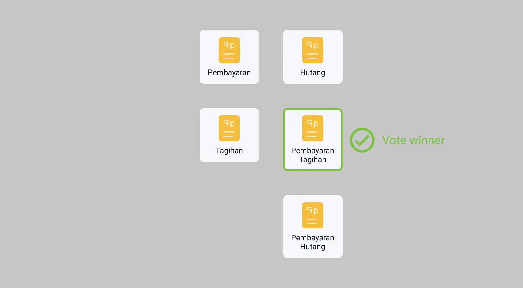
4. The word "piutang" confusing me, it should changed to "hutang" or "pembayaran hutang", or "pembayaran tagihan"
- Location : homepage
- Problem detail: user confused when they wanna enter due date payment page, the name "piutang" confused them.
- solution : do some vote for alternative name
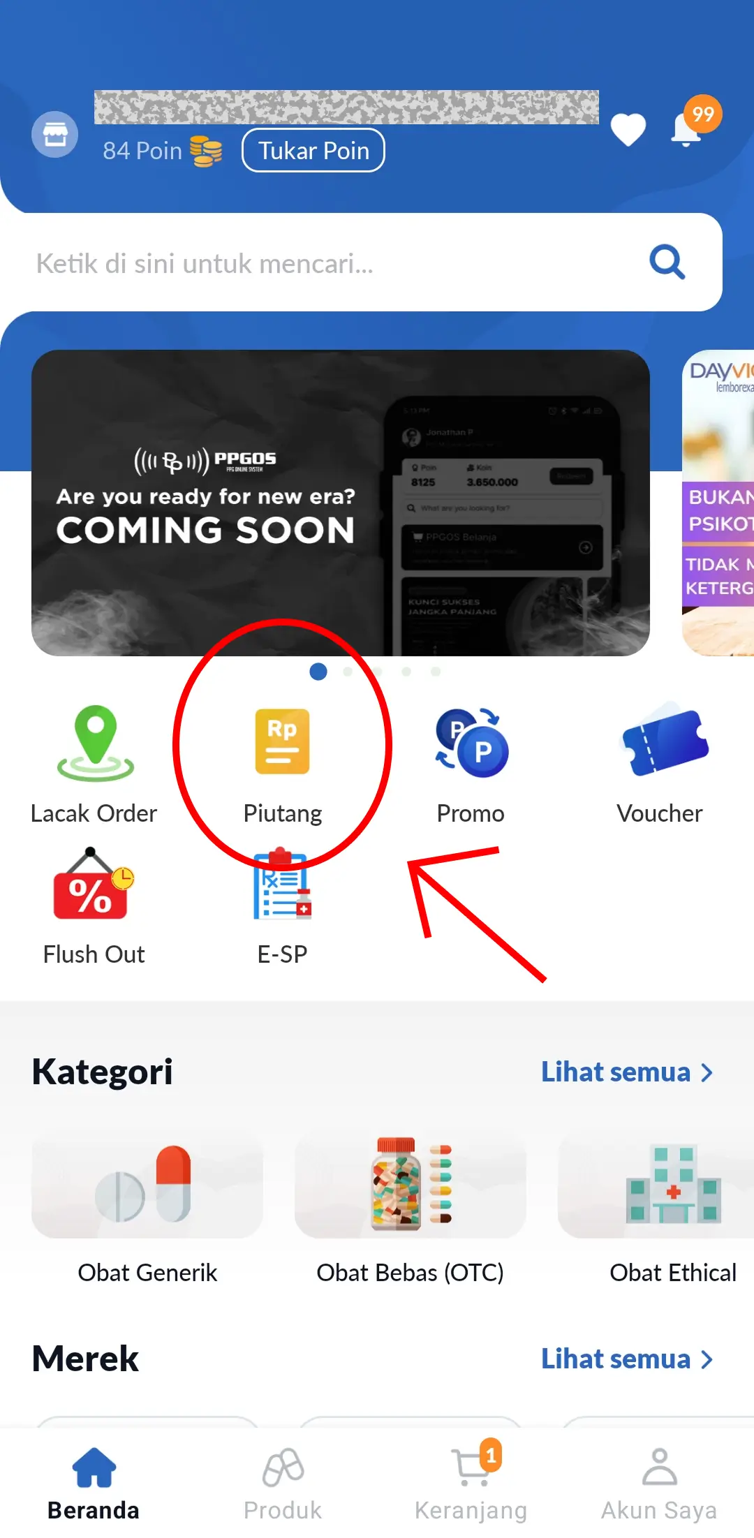
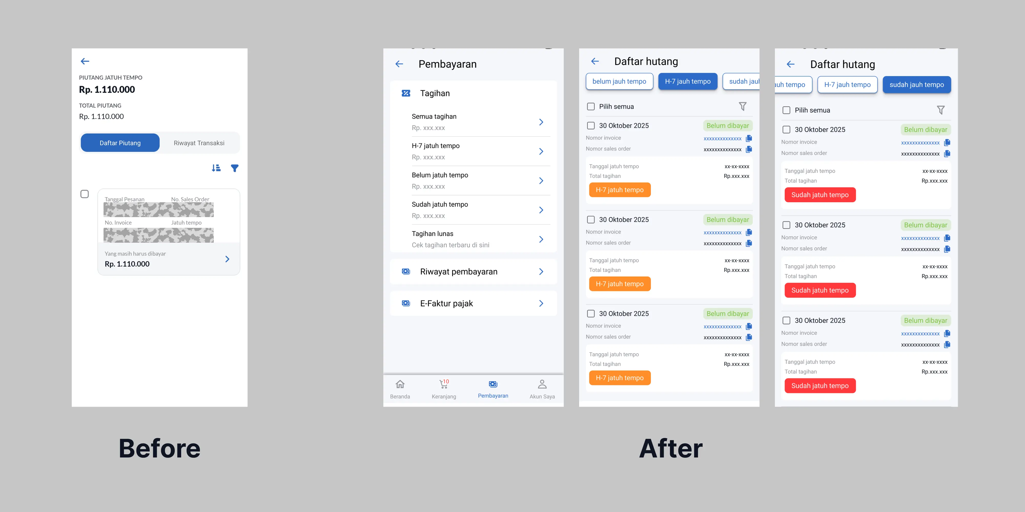
5. To access due date invoice list, we have to click to click button on two different pages
- Location : "pembayaran tagihan" page
- Problem detail : when user wanna check and pay the due date invoice. They have to choose the "distributor" and then check the list.
- solution : redesign new flow for user. Add new menu on homepage to choose the distributor
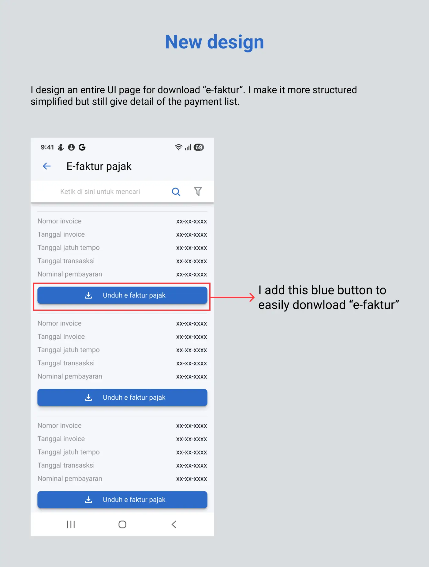
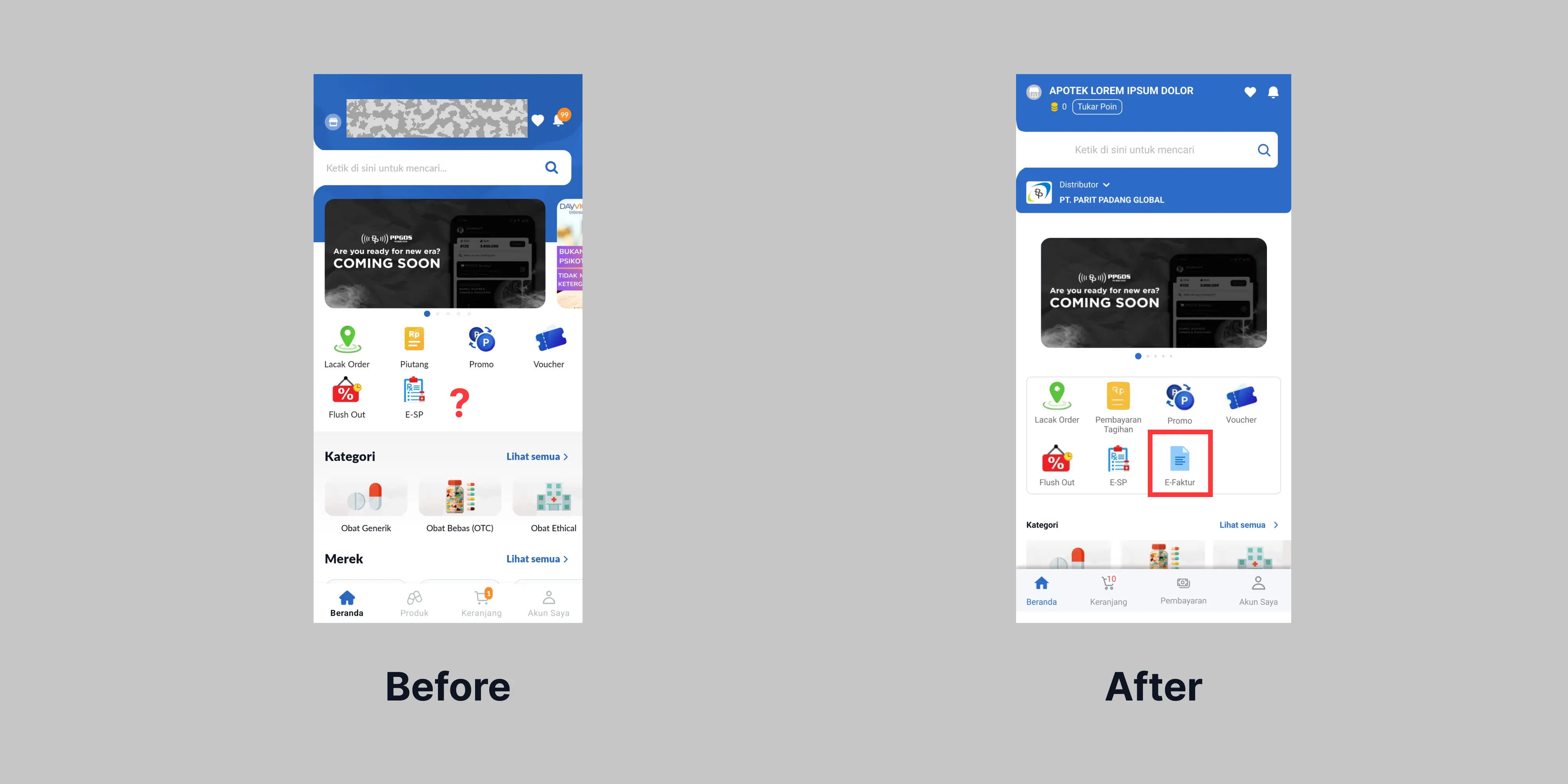
6. The flow to access and download invoice (e-faktur) confusing me, there's should button placed on the home or on payment page.
- Location : homepage
- problem detail : there's no menu/ button on the app that explicitly tell download invoice (e-faktur)
- solution : add new icon menu on homepage that can download invoice (e-faktur). add new menu on due date payment to download invoice (e-faktur).
5) Actionable insight
Automatically set product view card quantity to one piece.
Add chart button on search result page
Add chart button on search result page
Add plus button in card product in search result page.
change payment menu icon name
Add distributor/supplier choose on search page
Add new menu on homepage to choose the distributor
Design new page and new user flow for payment page
change the navigation bar
Design new page and new user flow for order product
Redesign new page and new user flow for download invoice document
Do some vote for alternative name
Redesign product view card
Redesign search result page
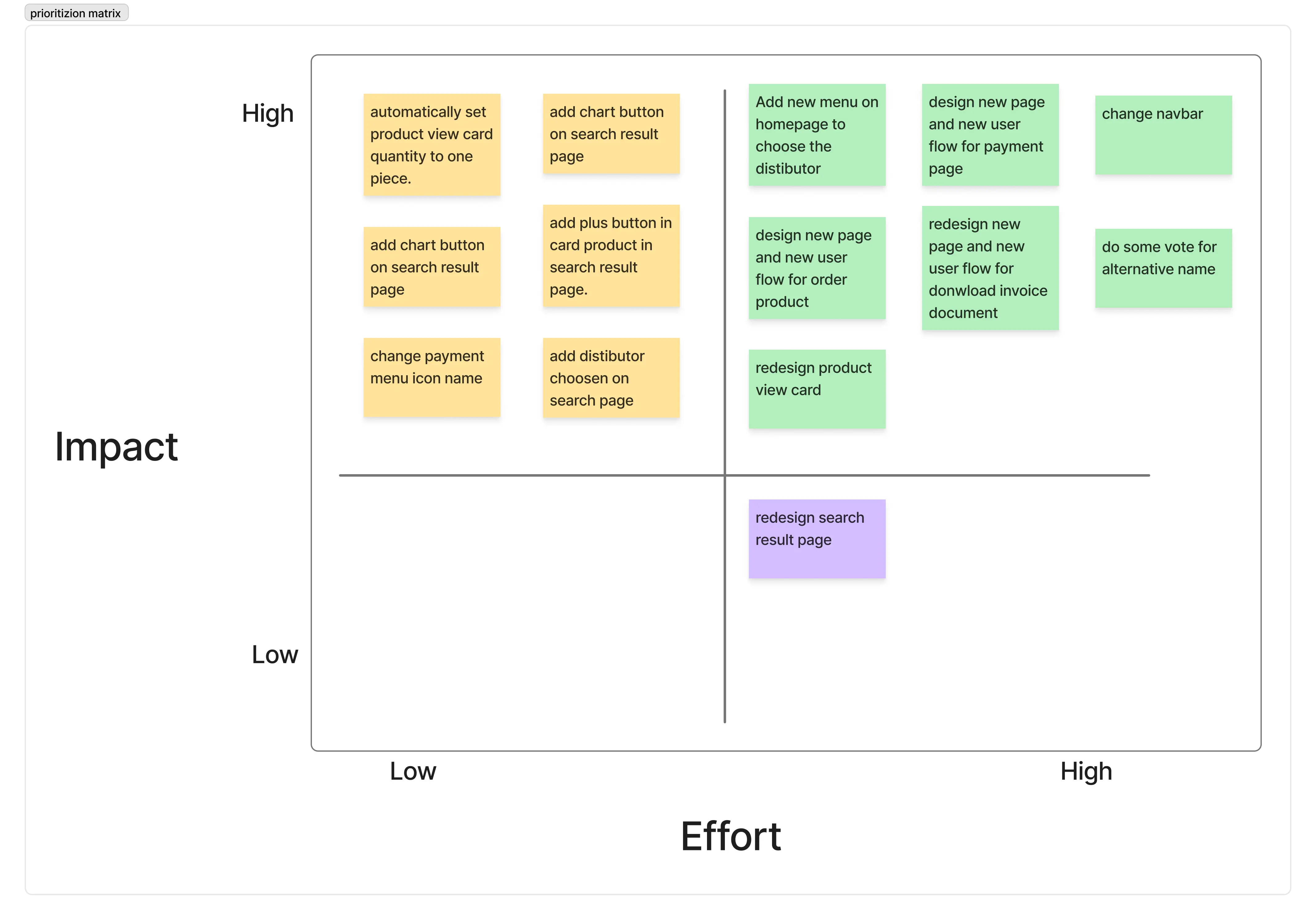
6) Prioritizion matrix
From the opportunity that we get from user journey map, I create a priority matrix to consider which opportunities I will implement into the design improvements.
7) Competitor app comparison analysis
For business importance, I'm already tested B2B marketplace made by competitor company. I use same task as I use on the "PPGOS" app.
Emos app
Usability testing result current design on "EMOS" app
User | Task 1 | Task 2 | Task 3 | Task 4 |
|---|---|---|---|---|
User 1 | 25 s | 3 s | 15 s | 5 s |
User 2 | 24 s | 4 s | 16 s | 4 s |
User 3 | 27 s | 5 s | 18 s | 6 s |
User 4 | 28 s | 3 s | 15 s | 3 s |
User 5 | 25 s | 5 s | 19 s | 5 s |
The attachment video :
Task 1
Task 2
Task 3
Task 4
GPOS B2B app
Usability testing result current design on "GPOS B2B" app
User | Task 1 | Task 2 | Task 3 | Task 4 |
|---|---|---|---|---|
User 1 | 22 s | 2 s | 14 s | 5 s |
User 2 | 24 s | 4 s | 15 s | 4 s |
User 3 | 26 s | 4 s | 12 s | 6 s |
User 4 | 25 s | 3 s | 13 s | 5 s |
User 5 | 23 s | 2 s | 11 s | 5 s |
The result shown that the average user easily finish all the task. Some user say that they fell easier because of clear icon, clear name, and they know which button they want to click to finish the task.
The attachment video :
Task 1 :
Task 2 :
Task 3
Task 4
Stage 3 - Ideate
1) User flow
User flow for task 1 :
User flow for task 2 :
User flow for task 3 :
User flow for task 4 :
2) Information architecture
3) Wireframe
Wireframe for task 1 :
Wireframe for task 3 :
Wireframe for task 4 :
4) Style guide
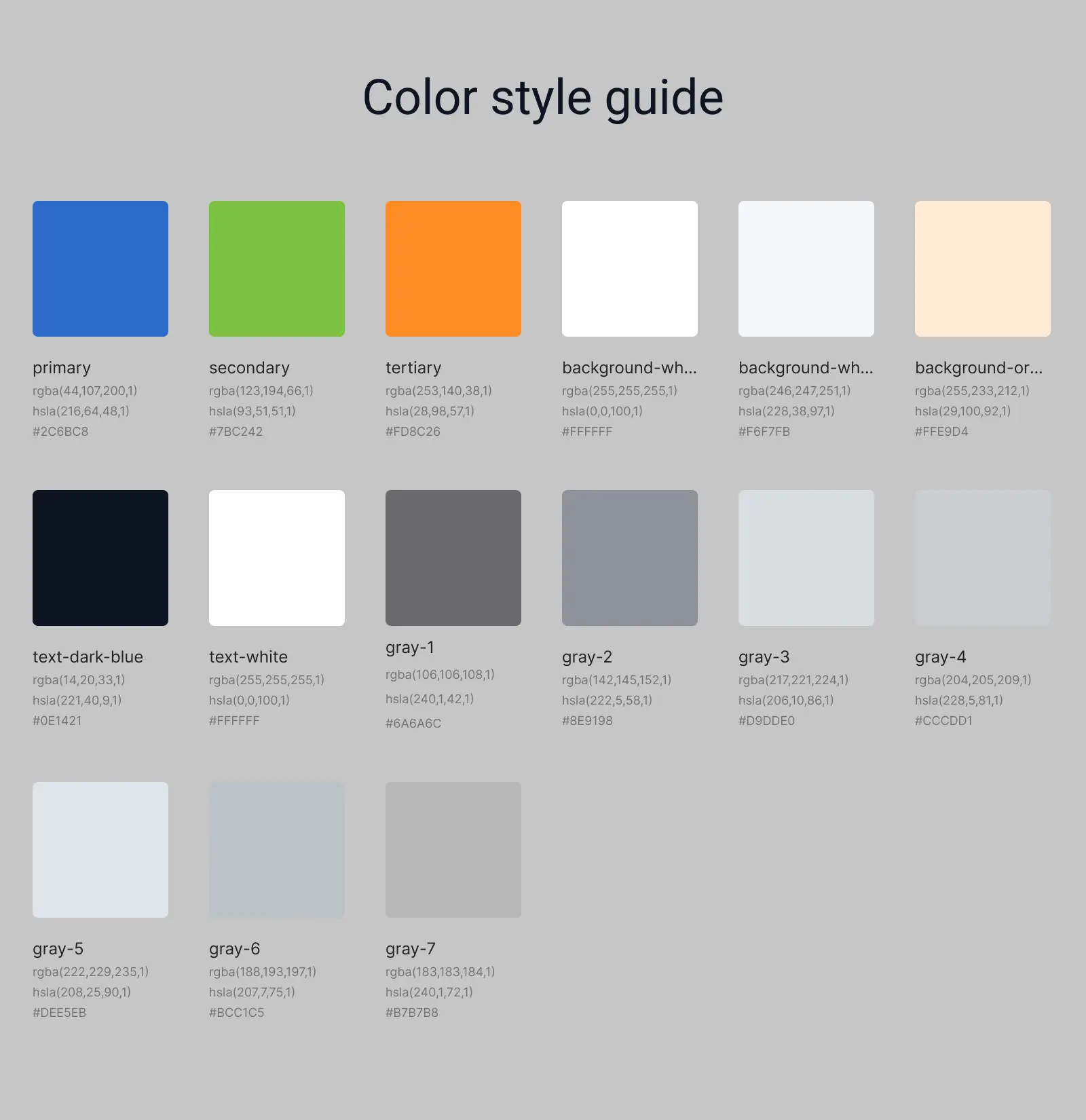
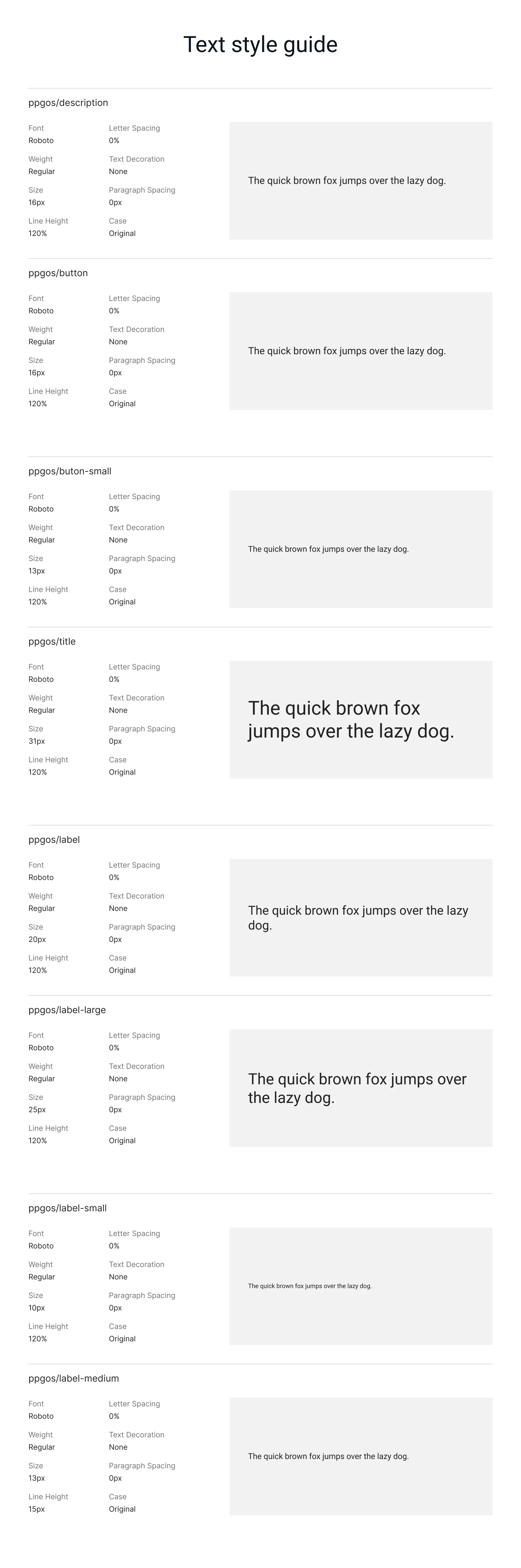
Because of I can't get the access for the official style guide that used for the app. I try to "reverse engine" the style guide. So here's the result :
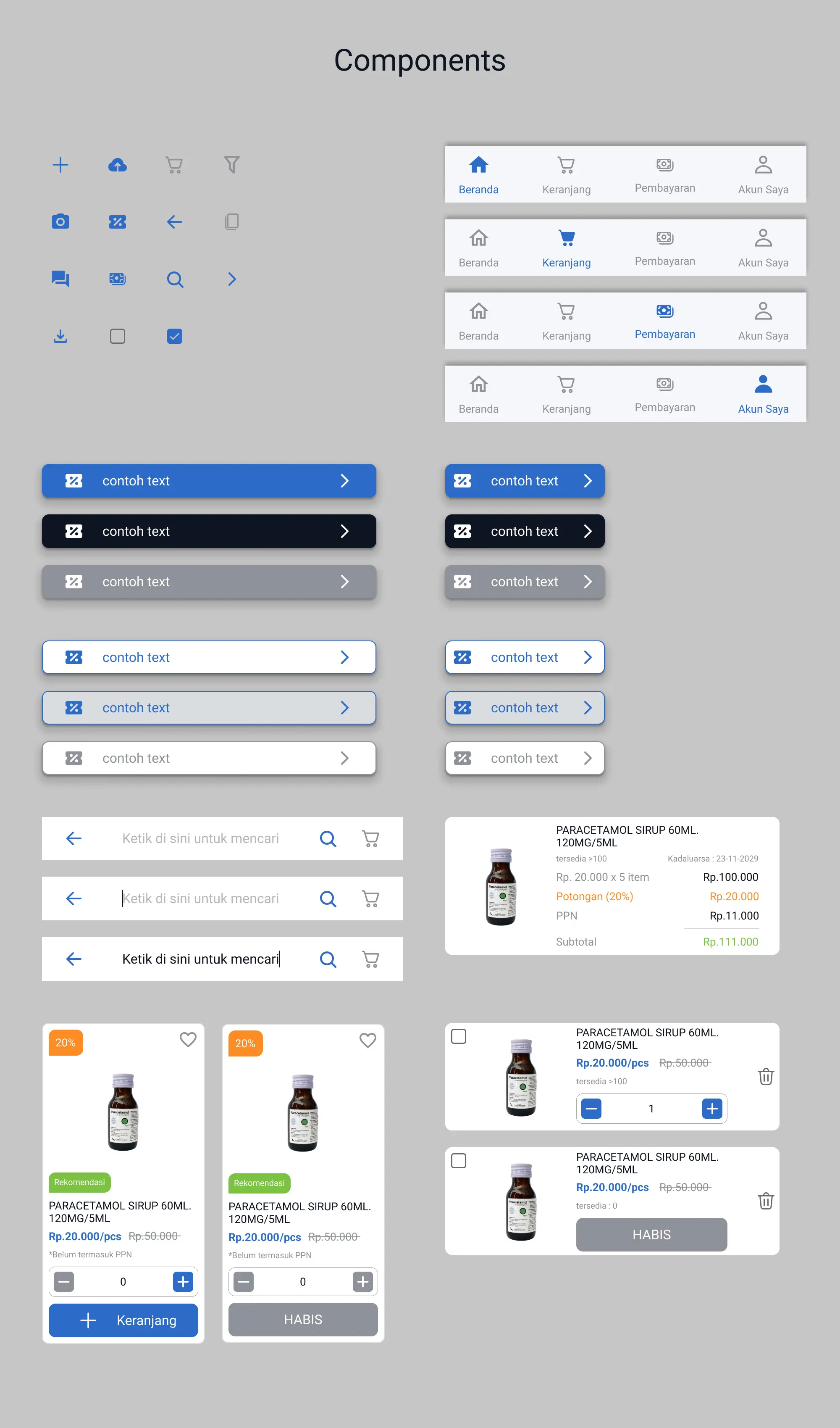
5) UI redesign
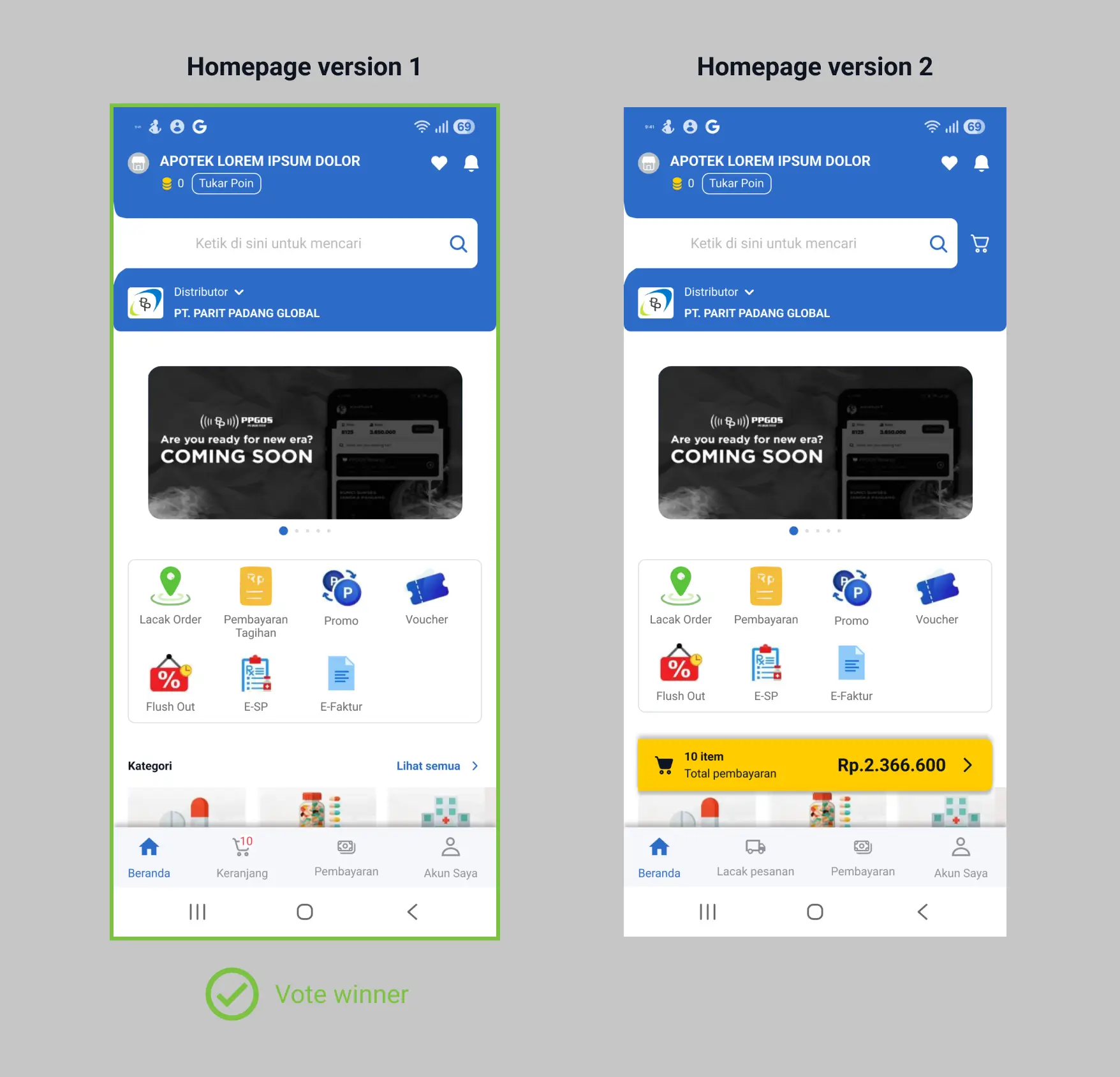
Homepage
The homepage is a page that will first appeal when the user open the application. I made some changes to simplify user and make it easier.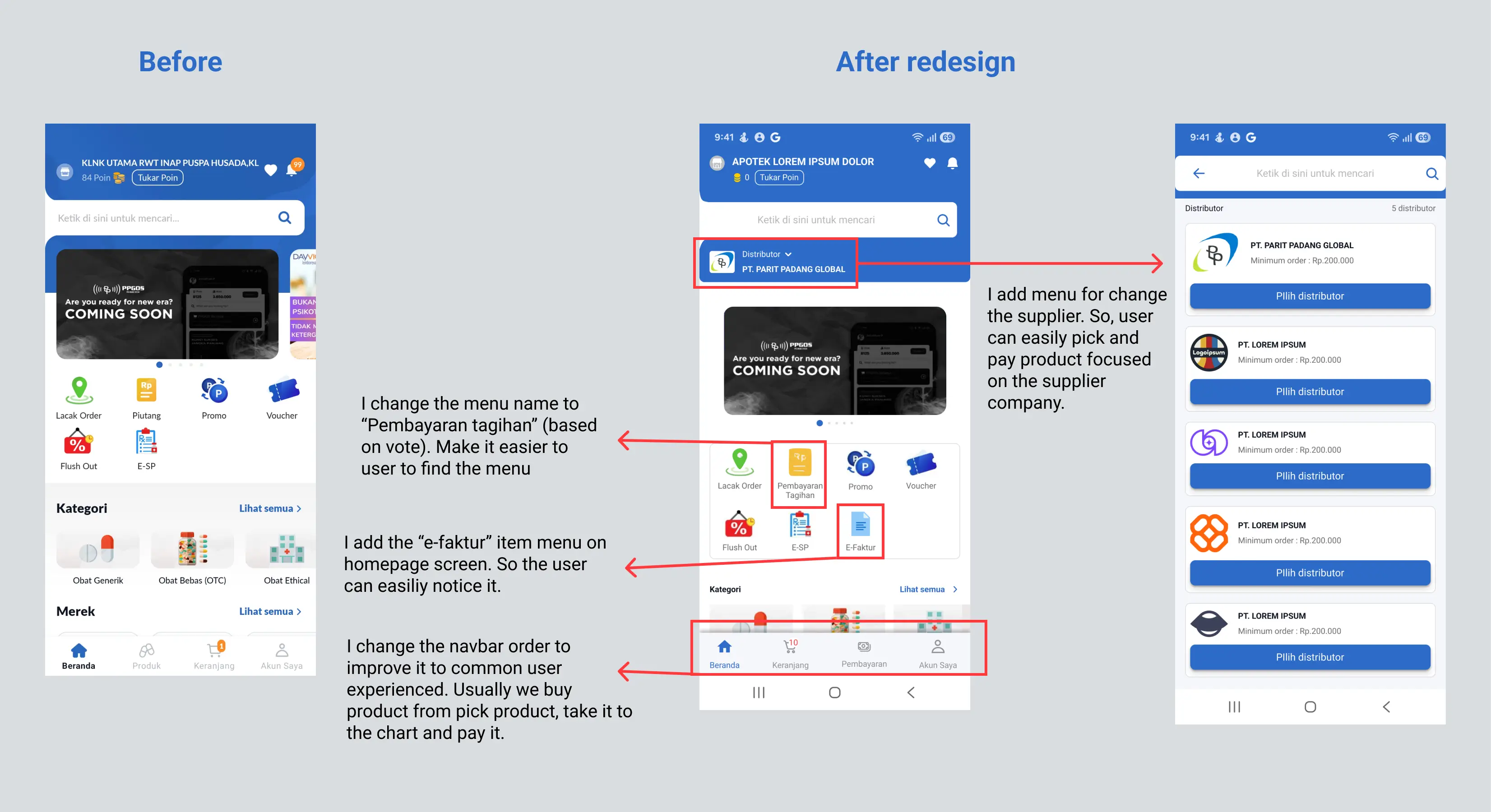
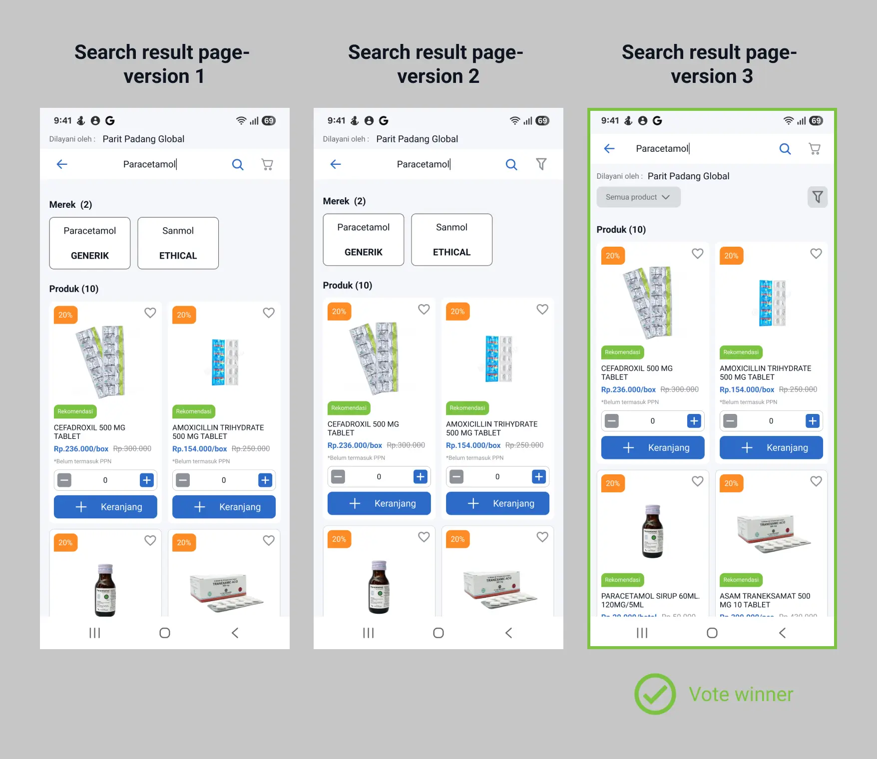
Search result page
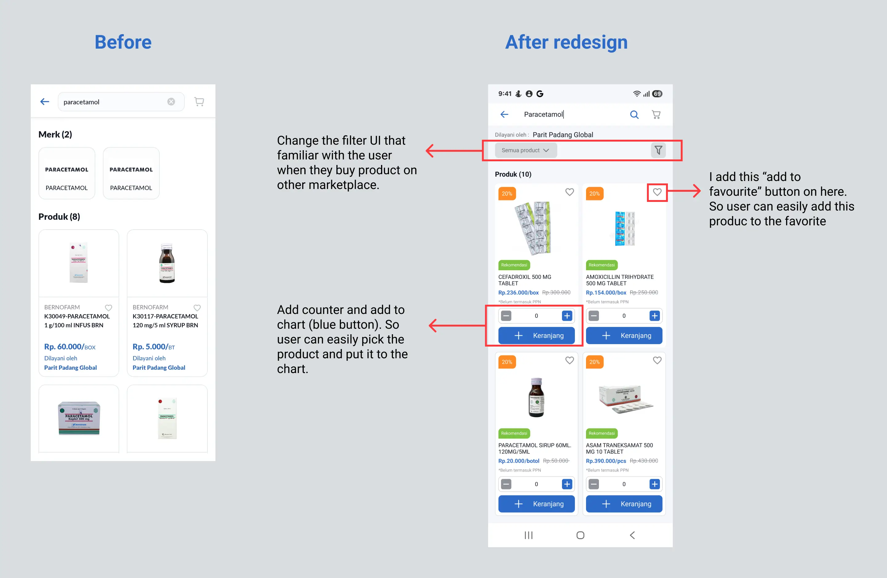
Card for product view
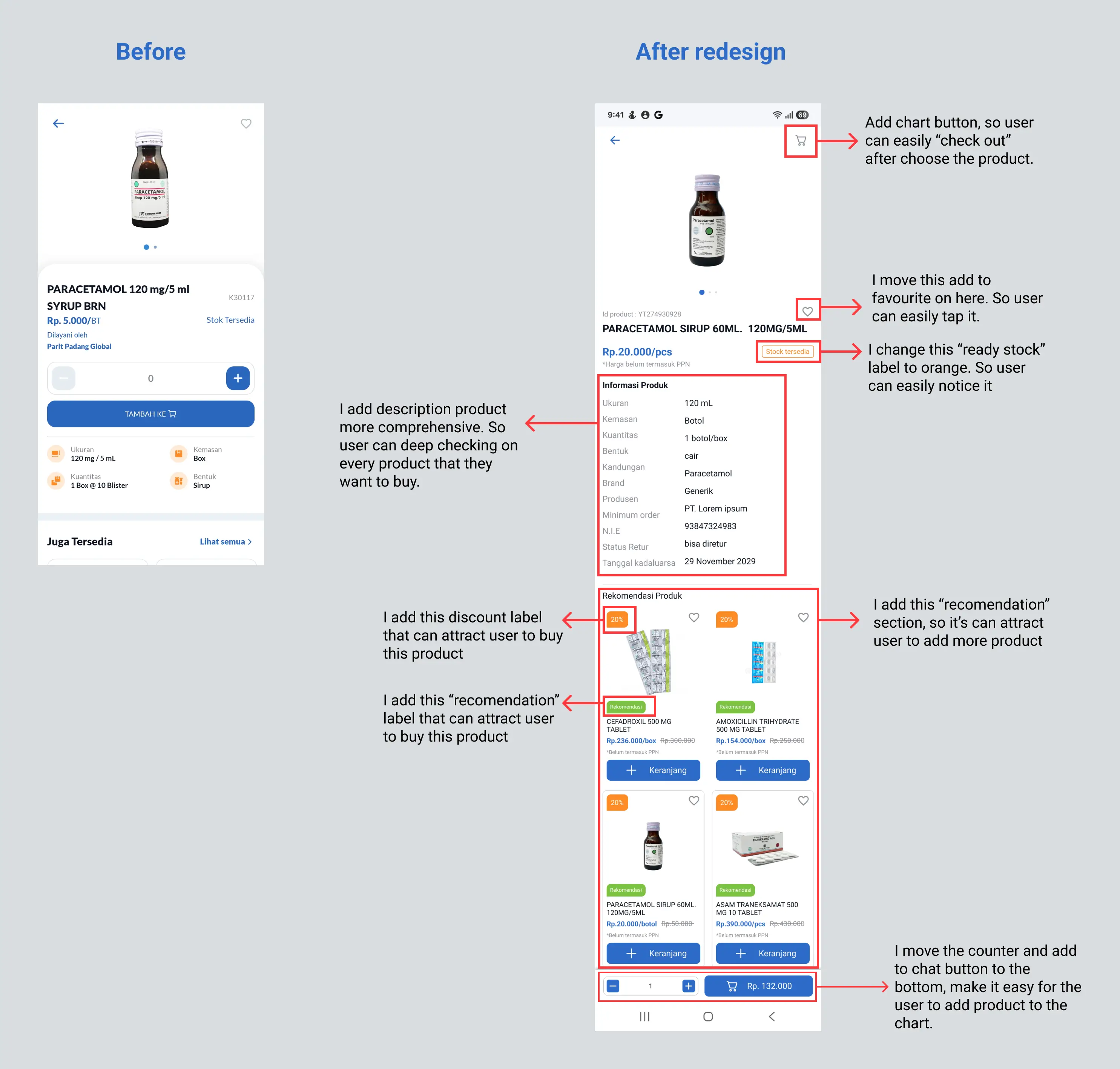
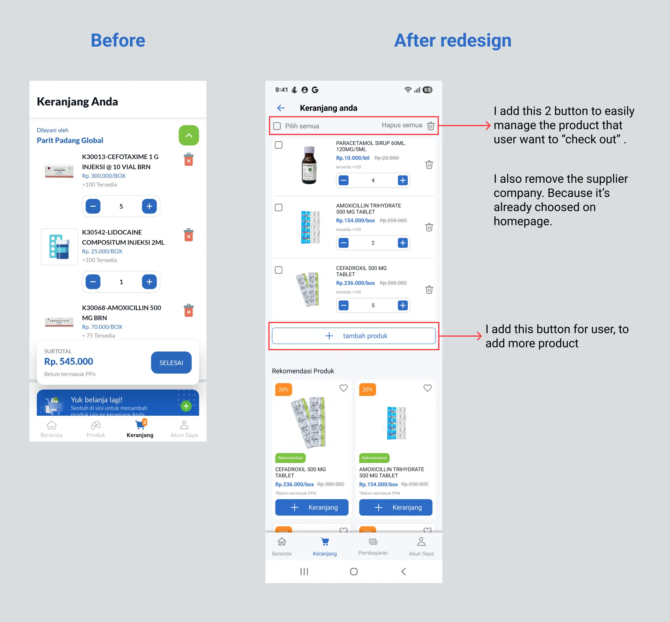
Chart
Payment flow
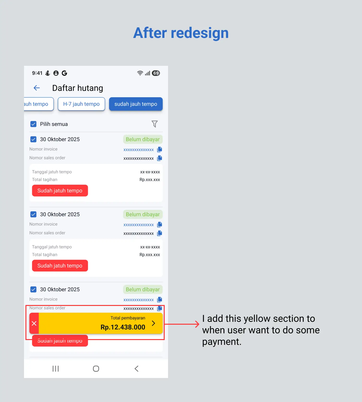
Download invoice page
Stage 4 - Prototype
https://bit.ly/prototype_mobile_ppgos
Stage 5 - Test
1) Usability Testing After Redesign
After redesign and evaluate it. I tested 5 users who already participated in the first test using the same task scenario like in the first test. This was using a Figma prototype. The users asked to run the prototype on the same device. This test also aim to know what the user’s expectations of the new design. The user also give a vote and suggestion about what kind of what item and component should be implemented on the app.
Task 1
Task: User try to buy a product
Scenario : Imagine you want to purchase a product, what step you did to do this?
Result : User can easily complete this task. It's because of new added of counter button, chart button, and automatically set product view card quantity to one piece. User automatically click the plus button on the counter and then click the "add to chart" button. This task completed easily by user because they no longer need to click the view card product. it can reduce step for the user to purchase the product.
Task 2
Task : user check order or shipment status
Scenario : imagine you want to check your procurement progress, what you gonna do?
Result : User can easily finish the task 2 on current design. So, there's no need to change and or improve the current design.
Task 3
Task : user try to pay the due date invoice
Scenario : imagine you want to pay your due date invoice, what step did you pick ?
Result : User can easily notice the payment menu because off renaming the icon menu. After that, user easily can finish the payment of the due date invoice. it's because of the redeseign a new user flow and a whole new UI.
Task 4
Task : user try to download the invoice (e-faktur)
Scenario : imagine you need .pdf file for your purchasing invoice for your document archive?. Which step would you pick?
Result : user really easily download the invoice (e-faktur) because of new added icon menu on homepage.
2) Testing result after redesign
The results of the usability test on the new design, get positive results than the first usability test on the current design. All users can easily finish every task and get better results than the first usability test. Here's the table of result on the after redesign :
User | Task 1 | Task 3 | Task 4 |
|---|---|---|---|
User 1 | 44 s | 20 s | 2 s |
User 2 | 51 s | 16 s | 2 s |
User 3 | 42 s | 17 s | 6 s |
User 4 | 43 s | 16 s | 7 s |
User 5 | 48 s | 24 s | 2 s |
Task 2 skipped, because of there's no struggle that can inhibit user to complete the task.
Parameter calculation
Success/ completion rate : this matrix measurement depending on user's success on completing task, recorded as 1. If user can't, recorded as 0 (1=Task Success and 0= Task failure).
Table of testing result on current design
User | Task 1 | Task 2 | Task 3 | Task 4 |
|---|---|---|---|---|
User 1 | 55 s | 5 s | 40 s | 23 s |
User 2 | 80 s | 5 s | 15 s | failed |
User 3 | 70 s | 16 s | 19 s | failed |
User 4 | 60 s | 8 s | 18 s | 35 s |
User 5 | 60 s | 10 s | 38 s | 29 s |
succes rate % = | number of succes task / total task x 100% |
|---|---|
task 1 : | 5/5 x 100 % = 100 % |
task 2 : | 5/5 x 100 % = 100 % |
task 3 : | 5/5 x 100 % = 100 % |
task 4 : | 3/5 x 100% = 60% |
Levels of Success
Success rates are easy to measure, with one major exception: How do we account for cases of partial success? If users can accomplish part of a task, but fail other parts, how should we score them?
Here is the several levels of success:
complete success: the user can complete the task with no error.
success with one minor issue : the user can complete the task, but still there's mistake on clicking wrong icon but still on the same user flow, still on the same page.
success with a major issue : the user can complete the task, but there's mistake on clicking wrong icon, out from the page, experienced kicked from right user flow, .
failure: the user can't complete the task.

Time on task/ time completion : Time on task (TOT) tells you how long it takes a user to complete a task. Here'is how to calculate time on task :
Table of testing result on current design
User | Task 1 | Task 3 | Task 4 |
|---|---|---|---|
User 1 | 55 s | 40 s | 23 s |
User 2 | 80 s | 15 s | failed |
User 3 | 70 s | 19 s | failed |
User 4 | 60 s | 18 s | 35 s |
User 5 | 60 s | 38 s | 29 s |
average | 65 s | 26 s | 29 s |
Table of testing result on after redesign
User | Task 1 | Task 3 | Task 4 |
|---|---|---|---|
User 1 | 44 s | 20 s | 2 s |
User 2 | 51 s | 16 s | 2 s |
User 3 | 42 s | 17 s | 6 s |
User 4 | 43 s | 16 s | 7 s |
User 5 | 48 s | 24 s | 2 s |
average | 45.6 s | 18.6 s | 3.8 s |
Percentage efficient : | variance average TOT / average task on current design x 100% |
|---|---|
task 1 | 29.846% |
task 3 | 28.462% |
task 4 | 86.897% |
It's mean the new design can improve efficiency on task 1 = 30%, task 3 = 28 %, task 4 = 87%
3) New design feedback
"The counter button really helpful, I don't need to view the card product to add it to the chart"
"It's nice, I dont need to clickplus button to add 1 piece"
"Chart button is here now, I dont need to back to last page. Ahhh really helpful"
"Ahh, this is what I mean. I can easily find the payment menu"
"wow, the interface is new. I can easily check and pay my invoice"
"yeah, this is what i mean. a button that can easily forward to my procurement list"
4) Voting result
There's five items that already proposed to the user. Every user choose which option of every item that comfort on their use case. Here is the list :
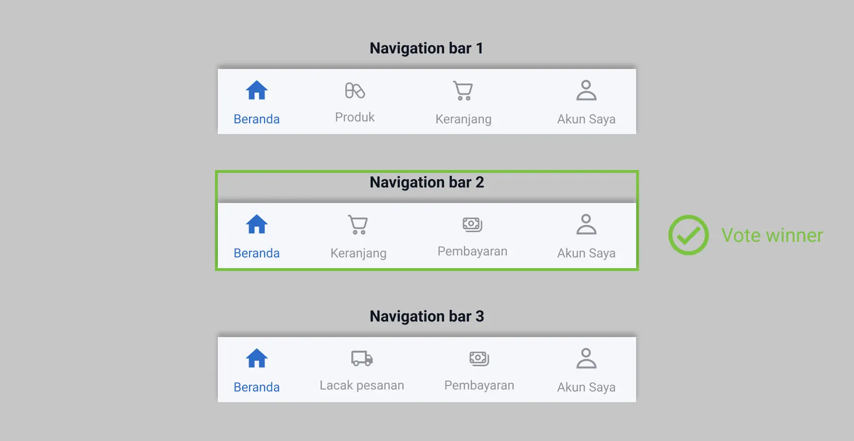
Navigation bar : 5 user vote for version 2
Icon menu name :
pembayaran tagihan : 3 user
pembayaran : 1 user
tagihan : 1 user
homepage UI design : 5 user vote for "homepage-version 1"
search result page :
search result page - version 1 : 1 user
search result page - version 3 : 4 user
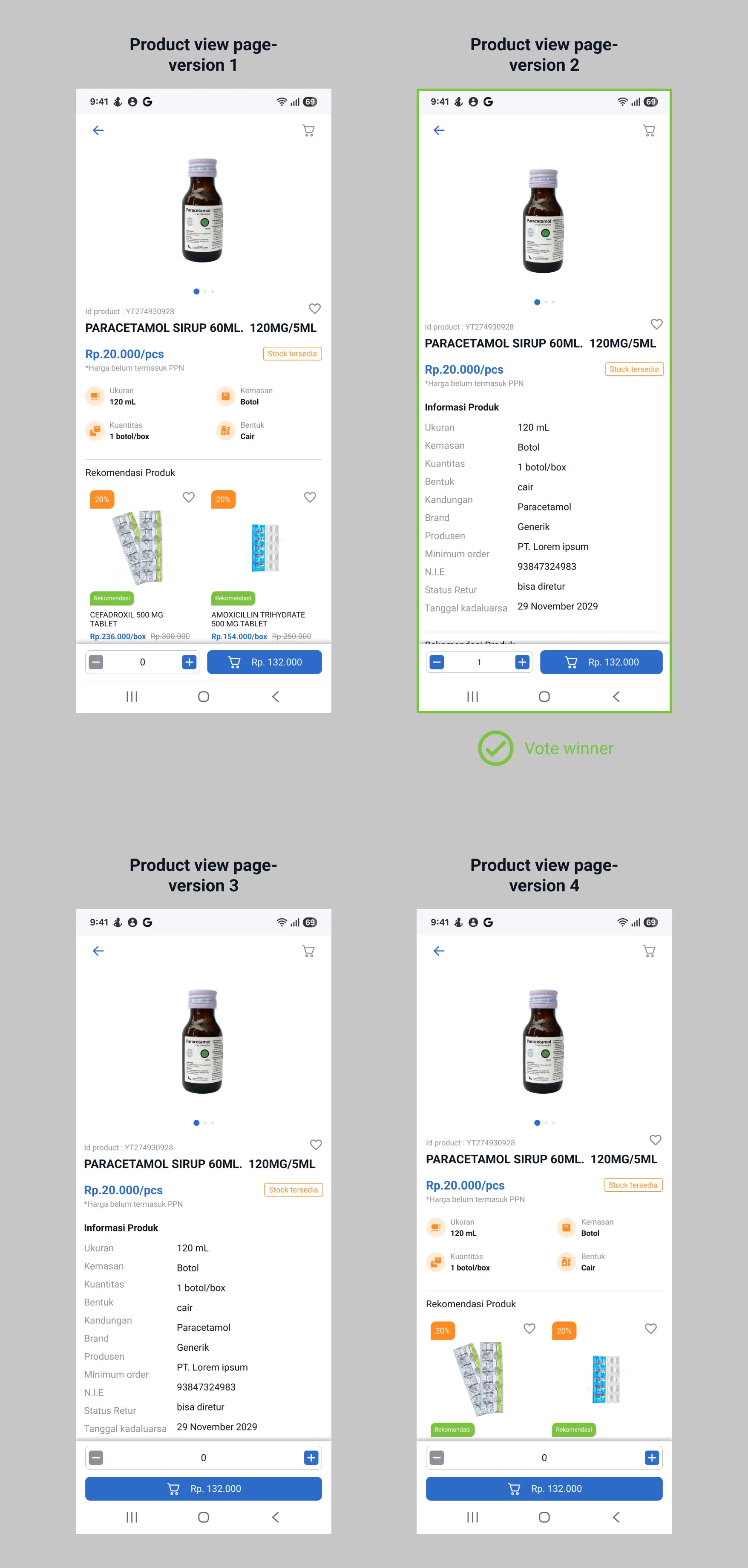
product view page
product view page - version 2 : 2 user
product view page - version 3 : 3 user
Conclusion
Overall, all users get pleasant experience after trying out the new prototype. The user's problem that they've complained about already solved. The new design can efficient their time 28-87% , so they can move on to other works.
Reference
https://medium.com/@ranandayoanko/ui-ux-case-study-ikea-application-redesign-be2893e6c99
https://www.behance.net/gallery/151330481/Redesign-Provita-Hospital-Website
https://www.nngroup.com/articles/success-rate-the-simplest-usability-metric/
https://www.nngroup.com/articles/qual-usability-testing-study-guide/
https://www.interaction-design.org/literature/topics/usability-testing#what_is_usability_testing?-0
https://www.interaction-design.org/literature/topics/design-thinking
Closing
This is the final part of my case study project, I got a lot of knowledge while finishing this project. Special thanks to all of my mentor, who help and support me on finishing this project. I open for critics and suggestions from you to help improve my knowledge and skills. I also open for collaboration if you have problem or project that I can be solved as an UI/UX designer.
Thanks a lot for your time and attention to read.